Signs And How They Communicate
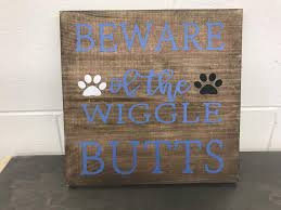
Looking back upon our travels in dozens of countries, there are some things that we find to be beautiful in their own way as they stand out from the mass-produced modern versions that are so popular these days and that is rustic signs and menus. While we find the modern signs to have their own sort of elegance, we are somewhat "old-fashioned" in our tastes and while we do have an appreciation for clean modern designs we are so often brought back by the warm embrace of natural wood's beauty. It should be noted that in this particular article we are using pictures from our travels in addition to our own work.
There are several factors to keep in mind when selecting your sign including selecting the appropriate materials (upcycled wood, wrought iron, stainless steel, etc.), a design that puts off the appropriate ambiance or feeling (i.e. cool and calming, hyping, modern, rustic, etc.), sign layout and balance as less is often more so it is readable, appropriate lighting, and many other factors to consider. The little yard signs at intersections that announce a fair, church service, or some sort of liquidation sale contains so much information that you can't even read it from 10 feet away. Signage is a very affordable way to advertise. Generally speaking, indoor and outdoor signs are more complex than they appear. During the design process, there are many factors and questions to consider. Most people don't realize their importance.
Avoid clutter and keep the signage visible and legible. Your sign is easier to see and understand at a glance if your message is short. There are many signs in every size and shape, so make sure you choose the appropriate size for where you expect your sign to be viewed from. Think about where it will be positioned and whether there will be obstructions. A sign's visibility is its most important feature.
Keep it clutter-free - Successful signage communicates information concisely. As few words as possible should be used to convey the message to your target audience. Overcrowding your sign with text or words makes it harder to read from a distance. White space refers to the area of a design left uncovered by either text or graphics (white space may also be a color). Design considerations such as the importance of white space around text and graphics are just as important. Many people tend to want to "fill up" the available space with as much copy as possible. But when text is crowded, it becomes harder to read. For optimal readability, 30 to 40 percent of a sign's face area should be left blank.
Typography and fonts - Generally, clean, crisp, easily readable styles of type should be used to maximize legibility. Professional fonts typically come in diverse weights, such as regular, bold, black, extended, etc. By giving priority to certain parts of the message, you can make your message stand out. Some people mistakenly believe that since ALL CAPITAL LETTERS are "larger," they will be easier to read at a distance. However, visual tests indicate that Lower- and Upper-Case Text is more readable from a distance than all upper-case letters. Since viewers may only have a few seconds to get your message, increase the readability of your sign by not overusing capital letters. It is generally recommended that you never use more than two different fonts in the same design. You can make your message stand out by selecting fonts that complement each other. Choose fonts that are easily readable at a distance.
By adding a border to images and graphics, you can increase reading speed by up to 25 percent. Borders are often recommended when automobile traffic is intended. This helps focus the eye on the message. Additionally, full-color digital photos can be included in designs to increase impact. Design and layout can also be enhanced with logos, artwork, and other graphical elements.
Colors for the foreground/background - Don't use anything that will make it difficult to focus on the main message when choosing a background for your design. Black contrasts well with any light color, and white contrasts well with dark colors. The greater the contrast, the more readable the text is from a distance. The contrast between colors that are closer together, like a Kelly-green letter on a royal blue background, will be less and therefore it will be harder to read.
The Outdoor Advertising Association of America (OAAA) tested 15 color combinations for readability at a distance. The results ranked in the sequence shown, with #1 the most legible and #15 as the least legible.
1. black on yellow
2. black on white
3. yellow on black
4. white on blue
5. green on white
6. blue on yellow
7. white on green
8. white on brown
9. brown on yellow
10. brown on white
11. yellow on brown
12. red on white
13. yellow on red
14. red on yellow
15. white on red
We are a full-service furniture decor business that provides a "one-stop solution" for all of your design needs including signage, but we primarily build other products, which is why we have included our work and signage that we saw while traveling.


